1 June 2026
Ever walked into a beautifully designed room and thought, “I don’t know why, but this just works”? More often than not, there’s a simple principle at play behind the scenes. It’s called the 60-30-10 rule, and once you understand it, you’ll never look at a room the same way again.
In this guide, we walk through everything you need to know about the 60-30-10 colour rule — from what it is and why it works, to practical examples and simple ways to apply it in your own space with confidence.
Table of Contents
What Is the 60-30-10 Rule?
The 60–30–10 rule is a widely used interior design guideline based on colour balance and visual hierarchy. As the name suggests, the approach divides a room into 60%, 30%, and 10% colour groupings:
- 60% — Your dominant colour or material. This is the main tone that anchors the space.
- 30% — Your secondary colour or material. Used to support the dominant shade, this layer adds depth, variation, and visual interest.
- 10% — Your accent colour or material. This is where personality comes through, introducing contrast, texture, or a bold pop of colour to complete the design.
The structure helps guide how colours are used across a space — from dominant surfaces through to supporting tones and smaller accent details. Each element plays its role, and together they create a cohesive, intentional look.
The 60–30–10 colour rule helps establish visual balance while still allowing enough contrast, texture, and personality to make a space feel uniquely your own. Rather than overwhelming a room with too many competing colours, the rule creates a sense of flow and harmony that feels considered, inviting, and intentionally designed.
Why Does It Work?
The rule works because it mirrors how the human eye naturally processes a space. Too much of one thing feels monotonous or overbearing, while too many competing elements can clash and feel chaotic. The 60-30-10 colour scheme gives the eye a clear visual hierarchy — a place to rest, a place to explore, and a moment of surprise.
It also gives you the freedom to be bold. Because your accent colour only covers 10% of the room, you can afford to go dramatic — a deep emerald, a rich terracotta, a striking matte black — without overwhelming the space. And this is one of the reasons the 60-30-10 rule interior design colour rule remains so popular — the rule provides enough guidance to create a cohesive, harmonious interior, while still allowing flexibility to experiment with colour, texture, and personal style.
Applying the Rule
Tiles are one of the most powerful tools in any designer’s kit, because they’re both functional and deeply expressive. Whether you’re tiling a bathroom, kitchen, laundry, alfresco area, or entire living space, the 60-30-10 rule translates beautifully. Here’s how to think about it:
The 60% — Your Foundation
This is your primary element of your room — the one that sets the tone for the entire space. Depending on the look you are after, it should feel calm, considered, and versatile. Think large-format stone-look porcelain tiles in a warm ivory or concrete grey, a classic subway tile in soft white, or natural timber-look tiles across the floor.
The 60% tile doesn’t need to be exciting on its own. Its job is to create a sense of cohesion and give the other elements room to breathe.
In many interiors, the 60% could be:
- Floor tiles
- Large wall surfaces
- Cabinetry
- Main paint colours
Neutral tones are commonly used as the dominant 60% because they create a timeless and versatile base. Soft stone-look tiles, warm beige tones, whites, greys and earthy colours are all popular choices for creating a calm and welcoming environment. Looking at a bathroom design for example, your main porcelain wall and floor tiles may make up the 60%, providing a backdrop for the rest of the space.
Design tip: Larger format tiles for the 60% make spaces feel bigger and more seamless. Minimal grout lines reinforce that clean, open feeling.
The 30% — Your Secondary Layer
This is where the room starts to gain personality. This layer should complement your primary finish while providing enough contrast to prevent the space feeling flat. Your secondary element might be a textured wall tile, a feature wall in a complementary tone, a mosaic on a splashback, or a different finish (matte vs. gloss, smooth vs. ripple).
The 30% doesn’t clash with the 60% — it complements it. For example, pairing warm stone-look floor tiles with timber-look cabinetry or textured wall tiles can create warmth, depth and visual interest without overwhelming the space. The key is ensuring the secondary elements support and enhance the dominant palette rather than compete with it.
The 30% could be your:
- Feature wall tiles
- Timber cabinetry
- Joinery finishes
- Splashback tiles
- Furniture or soft furnishings
Design tip: Playing with finish is often more effective than playing with colour at the 30% level. A gloss tile against a matt creates contrast and depth without disrupting the palette.
The 10% — Your Accent or Feature Moment
This is your moment to be bold. Your 10% accent within the 60-30-10 rule is where individuality lives. It’s the opportunity to introduce contrast, texture, or a statement detail — whether that’s a deep burgundy niche tile within a white shower recess, handmade-look tiles in a burnt amber tone surrounding a fireplace, or a patterned tile used as a feature strip or border detail.
Because it’s used sparingly, your accent can be bold without tipping the room into chaos. A feature splashback, patterned tile insert, statement basin, or stylish tapware and fittings, can instantly elevate a space while still maintaining overall cohesion.
The 10% could be your:
- Feature tiles
- Decorative mosaics
- Tapware finishes
- Furniture pieces
- Styling pieces
- Artwork or décor accents
Design tip: Accent details work especially well in architectural moments such as niches, splashbacks, and fireplaces. And while tiles are a popular way to introduce an accent colour or texture, your 10% can also come through in tapware and fittings, furniture pieces, lighting, artwork, or styling elements — all depending on the overall look and feel you want to create. These are the spots the eye is naturally drawn to, so make them count.
The 60-30-10 Rule in Action
Let’s take a look at some examples of this rule in practice:
Example 1 — Sun-Washed Bathroom
This bathroom uses the 60-30-10 rule beautifully to create an atmosphere that feels incredibly balanced and sun-drenched:
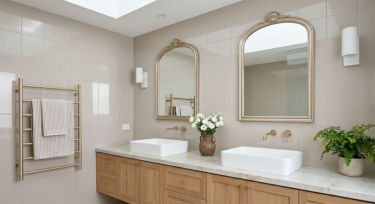
- 60% Dominant Colour: Glossy Warm Beige / Mushroom. Granite Gloss tiles on the wall reflect light beautifully for an immediate sense of calm and warmth.
- 30% Secondary Colour: Natural Medium Oak. The secondary layer introduces grounding, natural textures with the shaker-style light oak floating vanity.
- 10% Accent Tones: Brushed Champagne Gold. These accents provide the “jewelry” of the room, adding a layer of sophisticated elegance and a refined finishing touch.
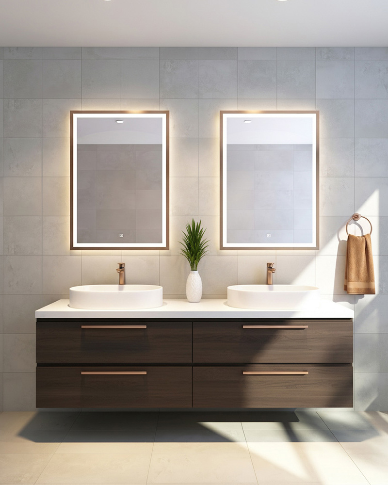
Example 2 — Warm Luxury Bathroom
This bathroom is a beautiful example of using warm neutrals with rich accent tones to create a luxurious yet inviting space.
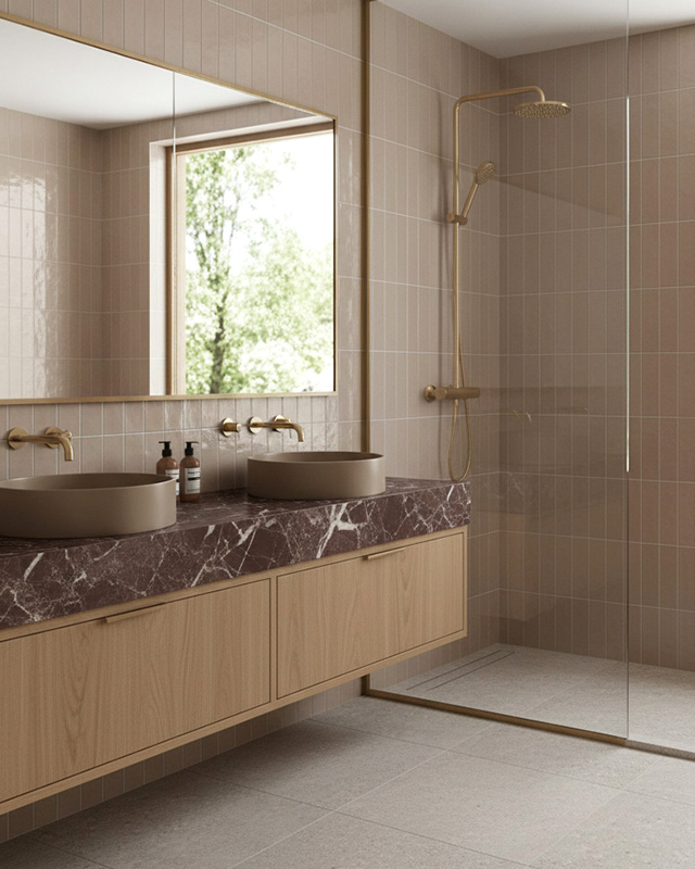
- 60% Dominant Colour: Taupe.
The vertically laid neutral-toned wall tiles anchor the space with a soft, warm foundation that feels calm and timeless. - 30% Secondary Colour: Light Grey.
Large-format Urban Cement light grey floor tiles support the primary palette while adding subtle contrast and depth to the room. - 10% Accent Colours: Burgundy Marble & Brushed Gold.
The heavily veined burgundy marble vanity top and brushed gold fixtures introduce personality and sophistication, drawing the eye without overwhelming the space.
Example 3 — Organic Minimal Laundry
This laundry showcases a beautifully balanced organic minimalist palette that feels fresh and calm.
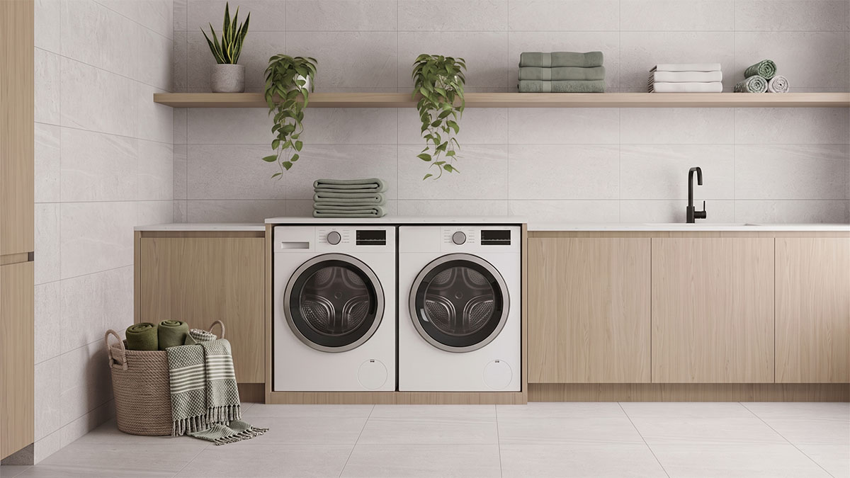
- 60% Dominant Colour: Pale Textured Grey. Large-format Desert light grey wall and floor tiles create a bright, seamless backdrop that sets the tone for the entire space.
- 30% Secondary Colour: Natural Light Oak. The warm timber tones soften the cooler stone-look finishes and add natural warmth and texture.
- 10% Accent Tones: Fresh Greenery. Styling elements such as trailing ivy, snake plants, and soft green accessories introduce subtle colour and bring life into the space.
Example 4 — Modern Bathroom
For a refined and modern aesthetic, this bathroom embraces the 60-30-10 colour scheme:
- 60% Dominant Colour: Warm Light Grey.
Pavement White tiles for the wall and floor create a calming and peaceful foundation for this bathroom. - 30% Secondary Colour: Dark Grained Wood.
This dark toned wood grain for the vanity contrasts the primary colour base to add depth. - 10% Accent Tones: Brass.
Brass fittings and styling accents add warmth, detail, and a sense of sophistication without overpowering the overall design.
Common Mistakes to Avoid
- Mistake 1: Flipping the proportions. Using a bold pattern or dark colour as your dominant tile can feel visually exhausting over time. Reserve drama for the 10%, not the 60%.
- Mistake 2: Ignoring grout as part of the equation. Grout colour is part of your interior design colour rule palette. A contrasting grout on a neutral tile can act as your 10% accent without adding another material. A matching grout makes tiles feel more seamless — great for the 60% and 30% zones.
- Mistake 3: Treating tile as the only variable. The 60-30-10 rule applies to your entire room — including cabinetry, fixtures, furnishings, and accessories. Your tile palette needs to work within the broader colour story, not fight against it.
- Mistake 4: Getting lost in the details. It’s easy to get caught up trying to calculate exact percentages or second-guess every colour choice, but great design is more about the overall feeling of the space. If every surface is bold and demanding attention, the room can quickly feel overwhelming. On the other hand, if everything blends together too closely, the space may feel flat or lacking personality. The key is finding the right balance between calm and contrast — think of the 60-30-10 rule as a design guide, not a hard rulebook.
Not Sure Where to Begin?
When selecting tiles and finishes for your next project, considering the 60-30-10 rule can help guide your decisions and make the overall design process feel harmonious, layered and visually appealing. Apply it thoughtfully, trust the proportions, and let your tiles do the talking.
At Johnson Tiles, we have an extensive range across all three tiers, from subtle, large-format foundations to statement-making feature tiles that will stop you in your tracks. Our instore team are always on hand to help you pull a palette together, whether you’re tiling a single bathroom or specifying an entire new build.
Ready to start building your palette? Visit your nearest Johnson Tiles showroom or browse our full tile range online.
Explore the tile collections at Johnson Tiles and discover inspiration for creating beautifully balanced spaces.