

3 August 2026
- Cool colours calm, warm colours energise. Blue and green tend to relax and soothe a space, while red, orange and yellow tend to stimulate and add energy.
- The same colour can feel completely different depending on saturation, light and finish. A soft, muted version of a colour reads as calmer and more sophisticated, while a highly saturated version feels more energetic — and a gloss finish will intensify a colour that a matt finish would soften.
- The 60-30-10 rule keeps colour psychology practical. 60% dominant colour, 30% secondary colour and 10% accent helps balance the mood you want to create with a room that still feels cohesive and liveable.
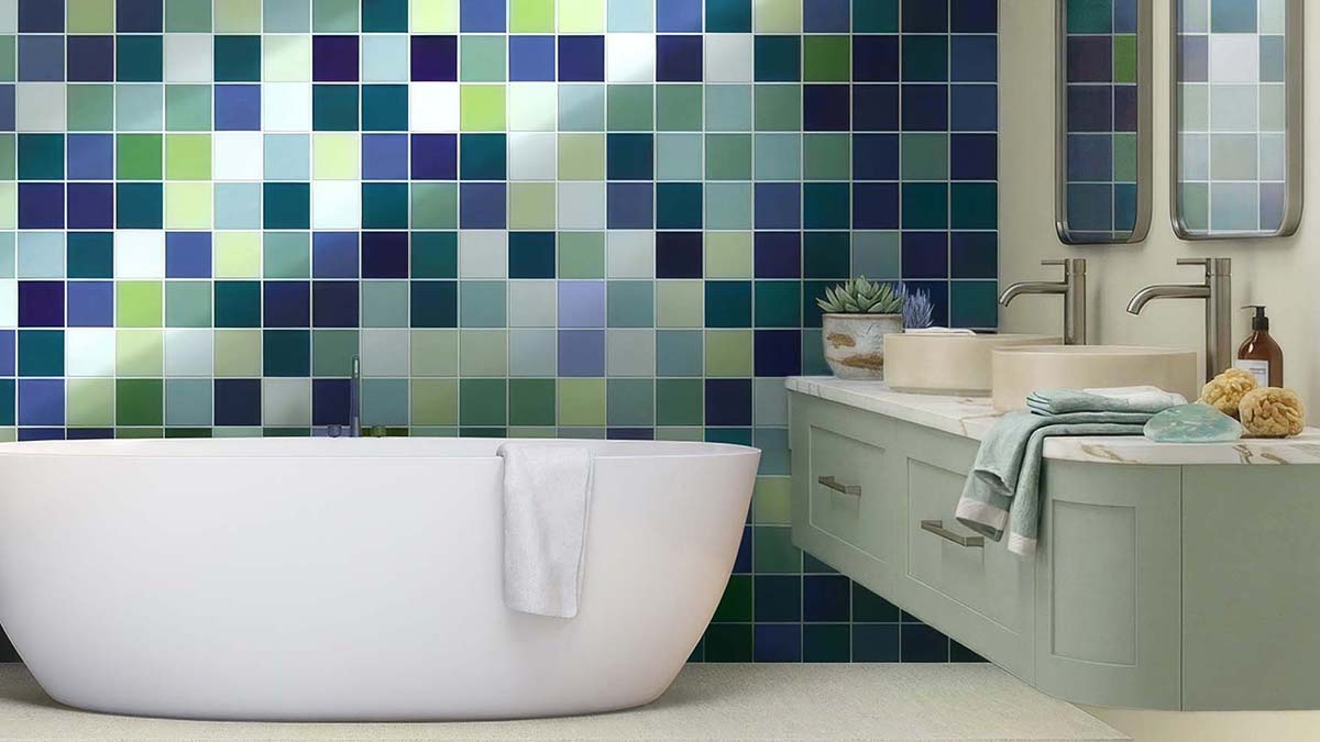
The colours you choose for your home do more than shape its appearance—they influence how a room feels and the way you experience it. When used thoughtfully, colour can make a compact bathroom feel more spacious, bring warmth to an open-plan living area, or create a sense of calm in a busy family home.
Understanding colour psychology in interior design can help you make more confident decisions when selecting paint, furniture, décor and, importantly, tiles. Whether you prefer soft neutrals, earthy tones or bold statement colours, the right palette can transform the way a room looks and feels.
In this guide, we explore colour psychology—how different colours influence mood, how to apply it across different rooms of your home, and practical tips for choosing tile colours that create the atmosphere you are looking for.
In this guide:
- What Is Colour Psychology in Interior Design?
- How Colours Influence the Feeling of Your Home
- Red: Passion and Energy
- Orange: Warmth and Comfort
- Yellow: Energy and Optimism
- Green: Balance and Renewal
- Blue: Calm, Focus and Serenity
- Purple: Luxury and Creativity
- Pink: Softness and Comfort
- Neutral: Balance and Simplicity
- White: Bright, Clean and Timeless
- Brown: Stability and Warmth
- Grey: Balance and Sophistication
- Black: Sophistication and Grounding
- Choosing Tile Colours for Your Home
- Frequently Asked Questions
What Is Colour Psychology in Interior Design?
Colour psychology explores how different colours can influence our emotions, behaviours and perceptions of a space. While it isn’t an exact science—and personal preferences, culture and life experiences all influence how we respond to colour—many of the emotional associations with colour are widely recognised and are used throughout architecture, interior design, retail and hospitality to help create particular moods and experiences.
When considering home interior colour choices, thinking about the mood you want to create is just as important as choosing colours you love. For example, soft blues are commonly linked with calm and relaxation, while warm tones such as terracotta and beige can create a sense of comfort and connection.
How Colours Influence the Feeling of Your Home
Every colour sits somewhere on a spectrum of warmth and coolness, with each bringing its own emotional qualities to a space. Understanding these associations can help you choose colours that support the atmosphere you want to create in each room of your home.
Red Colour Interior Design: Passion and Energy
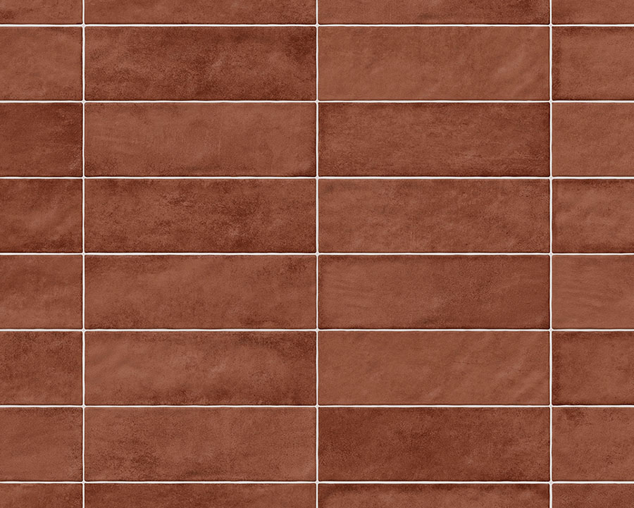
Red is associated with excitement, warmth and confidence. Because of its intensity, red is generally most effective as an accent colour rather than a dominant palette. Rich terracotta, rust and brick-red tones have become increasingly popular in Mediterranean, Industrial and Modern Organic interiors, where they introduce warmth without feeling overpowering. Used thoughtfully, red can add personality and visual interest while remaining timeless.
Colour Associations: Passion, energy, confidence, warmth and excitement.
Design Tip: Use red as an accent through splashbacks, feature walls or decorative tiles rather than covering an entire room.
Orange Colour Interior Design: Warmth and Comfort
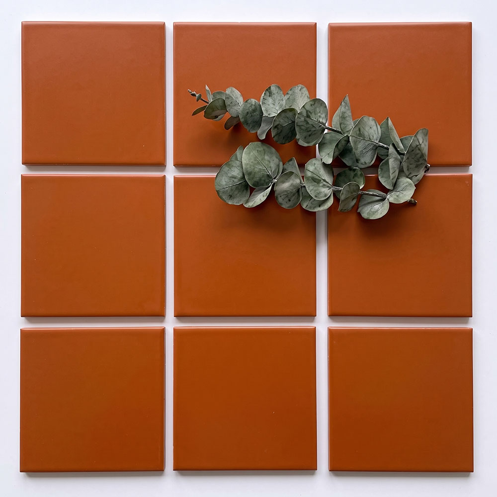
Orange combines the energy of red with the cheerfulness of yellow, and is strongly associated with warmth, comfort and sociability. In muted, earthy forms like terracotta and burnt orange, it’s one of the most popular tones in current home design – a grounding colour with warmth that creates a distinctive yet inviting space.
Colour Associations: Warmth, creativity, comfort, energy and sociability.
Design Tip: Burnt orange tones can be used as an accent to a natural colour palette, or even a block colour for a striking ‘wow’ moment in your home.
Yellow Colour Interior Design: Energy and Optimism
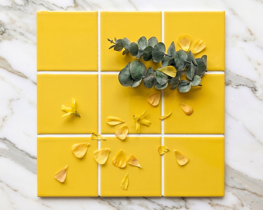
Yellow is often associated with happiness and optimism — it’s linked to sunlight and warmth, and tends to lift mood and energy in a space. It’s also one of the most attention-grabbing colours to the human eye. Soft buttery yellows have become increasingly popular as homeowners move away from stark whites, introducing warmth while maintaining a bright and uplifting feel. They work particularly well in Scandinavian and Mid-century Modern interiors where natural light is celebrated.
Colour Associations: Happiness, optimism, warmth, creativity and positivity.
Design Tip: Our Spectrum Buttermilk wall tiles feature a soft, muted yellow that’s ideal for introducing warmth and optimism into your home without the intensity of brighter, more saturated yellow tones.
Green Colour Interior Design: Balance and Renewal
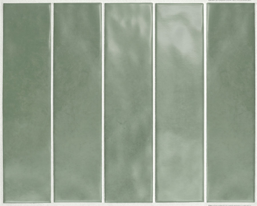
Green is closely tied with nature, balance and renewal, making it a popular choice for creating fresh and calming spaces. Green colour psychology in interior design explores how this connection with nature can influence the feeling of a room, helping create interiors that feel restorative, balanced and welcoming. Soft sage greens work beautifully in bathrooms and kitchens, while deeper emerald and forest greens can introduce luxury and depth to feature areas. For homeowners looking to create a nature-inspired space, green is a timeless choice.
Colour Associations: Nature, balance, renewal, harmony, relaxation and growth.
Design Tip: Sage green works beautifully with warm timber vanities and brushed brass fittings for a soft, nature-inspired palette.
Blue Colour Interior Design: Calm, Focus and Serenity
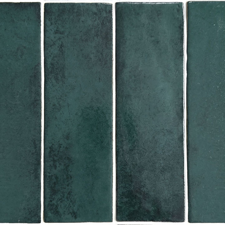
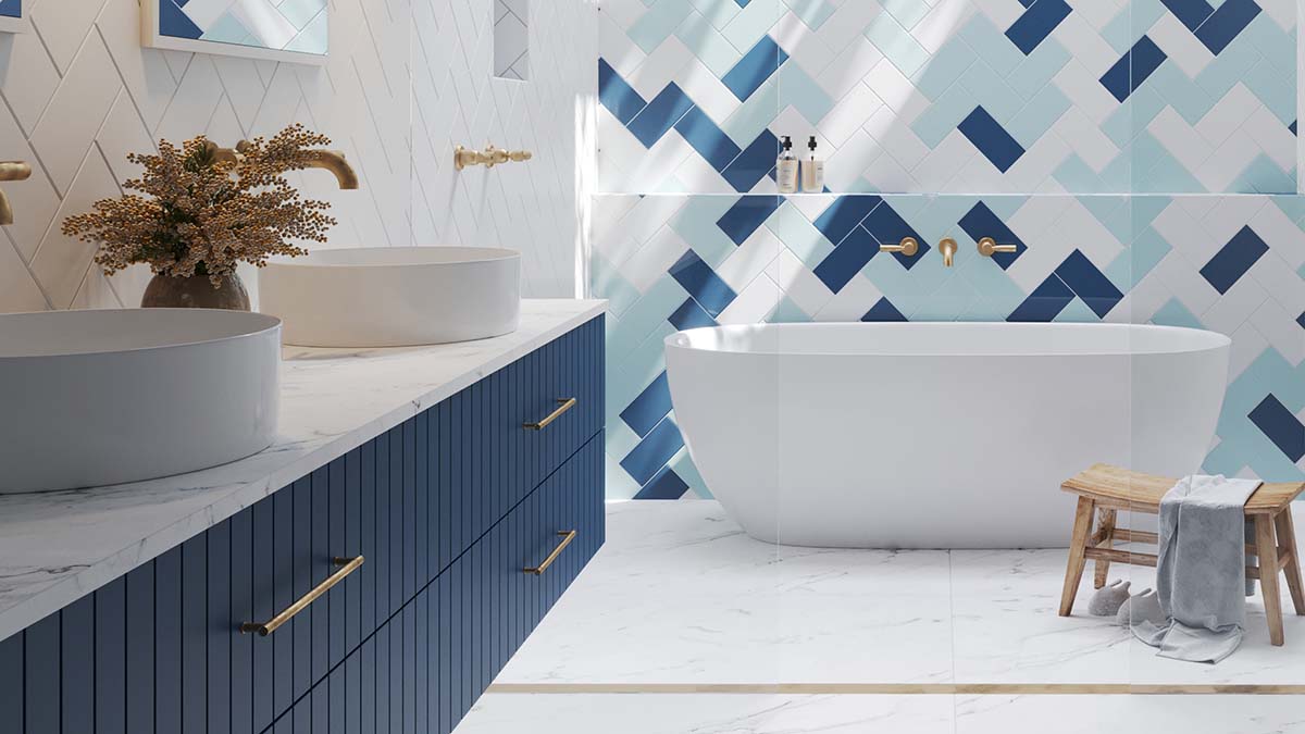
Blue is often associated with tranquillity, calmness and relaxation, making it a popular choice for spaces where you want to create a sense of retreat and comfort. In colour psychology, blue is commonly linked with feelings of stability and serenity, which is why it is frequently used in bedrooms, bathrooms and other areas designed for unwinding.
Blue is also a defining colour in coastal-style interiors, where it is combined with whites, soft greens and warm neutrals to reflect the colours of the ocean, sky and surrounding landscape. Whether used as a subtle accent or a feature colour, blue can help create a home that feels calm, balanced and connected to nature.
Colour Associations: Calmness, tranquillity, stability, trust and relaxation.
Design Tip: Pair blue tiles with white cabinetry, brushed nickel tapware and timber accents to create a timeless coastal-inspired bathroom.
Purple Colour Interior Design: Luxury and Creativity
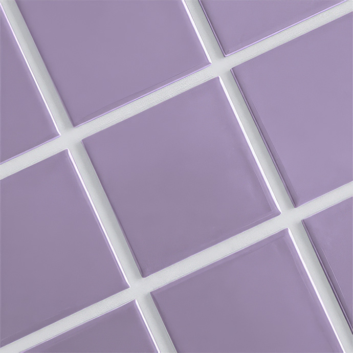
Purple has long been associated with luxury and creativity. Historically, this stems from the rarity and high cost of purple dyes, which were reserved for royalty and the wealthy. These centuries-old associations continue to influence modern design, where purple is often used to evoke sophistication, individuality, and creativity.
While less commonly used, purple colour in interior design can create striking feature areas when used thoughtfully. Soft lavender tones can create a relaxing atmosphere, while deeper purple shades can add richness and drama.
Colour Associations: Luxury, creativity, imagination, individuality and sophistication.
Design Tip: Use purple sparingly as a feature colour with neutral surroundings to keep the room elegant rather than overwhelming.
Pink Colour Interior Design: Softness and Comfort
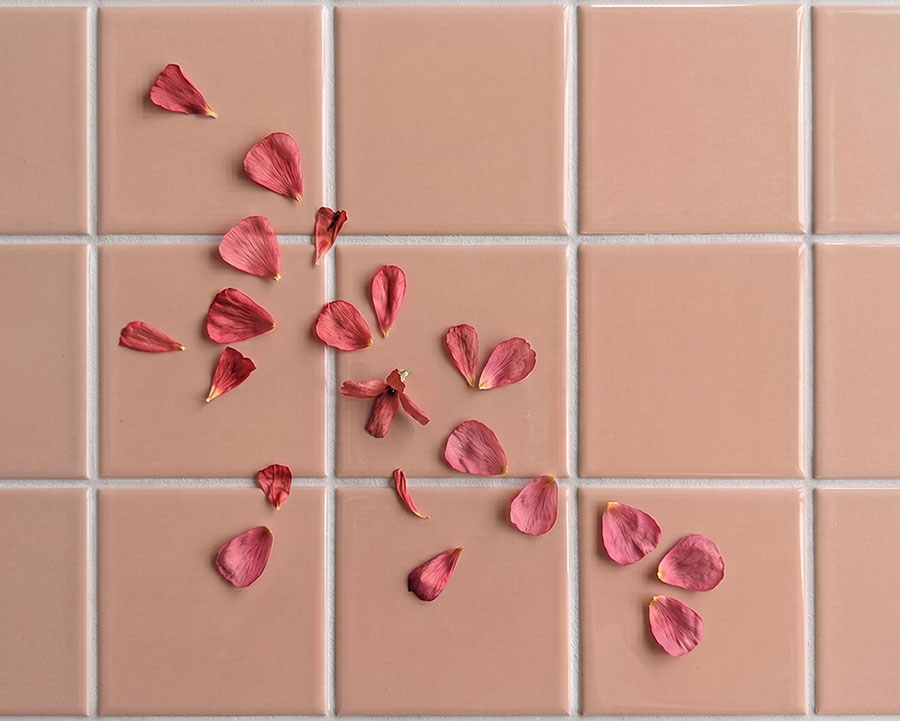
Pink is becoming increasingly popular in modern interiors, moving beyond traditional associations to create spaces that feel warm, sophisticated and welcoming. In colour psychology, pink is often associated with comfort, softness and calm, making it a versatile choice for bedrooms, bathrooms and living spaces.
Pink colour interior design can range from soft blush tones that create a gentle, calming atmosphere to deeper dusty pinks that add warmth, character and personality. When paired with natural materials such as stone, timber and brass accents, pink can feel elegant and contemporary rather than overly playful.
Colour Associations: Softness, warmth, care, comfort, calmness and creativity.
Design Tip: Dusty pink tiles pair particularly well with terrazzo, warm white walls and brushed brass fixtures.
Neutral Colours for Home Interior: Balance and Simplicity
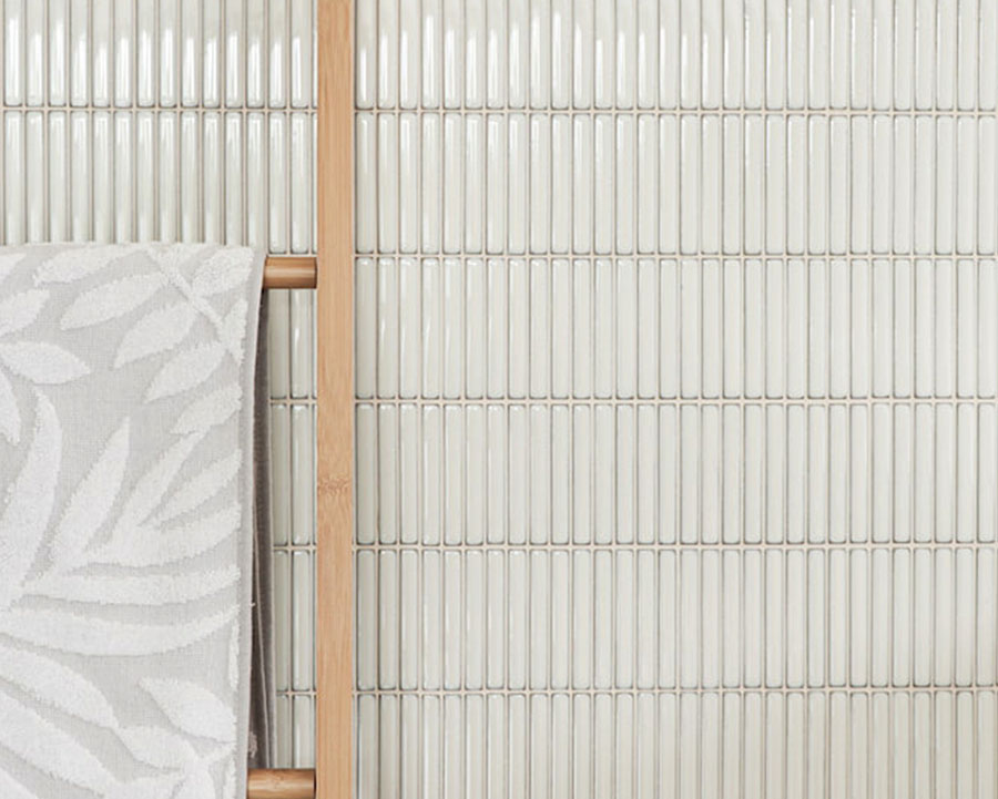
Neutral colours for home interior design, including white, beige, cream, sand, soft grey and taupe, create a calm foundation that provides flexibility and timeless appeal. From a colour psychology perspective, neutral tones are often associated with balance, simplicity and calm, helping create spaces that feel relaxed, considered and easy to live in. Unlike stronger colours, neutrals provide a versatile backdrop that allows textures, materials and accent colours to become more prominent.
Neutrals are a defining feature of many popular interior styles, including Modern, Scandinavian and Japandi design. Modern interiors often use whites, warm greys and natural tones to create clean, functional spaces, while Scandinavian and Japandi styles combine soft neutrals with timber, natural textures and simple forms to create a sense of comfort and tranquillity.
Colour Associations: Balance, simplicity, calm, harmony, timelessness and relaxation.
Design Tip: Layer different neutral tones and textures to create depth and warmth. Pair soft beige, warm whites and natural stone-look tiles with timber, linen or brushed metal finishes to create a space that feels calm and inviting rather than plain.
White Colour Interior Design: Bright, Clean and Timeless
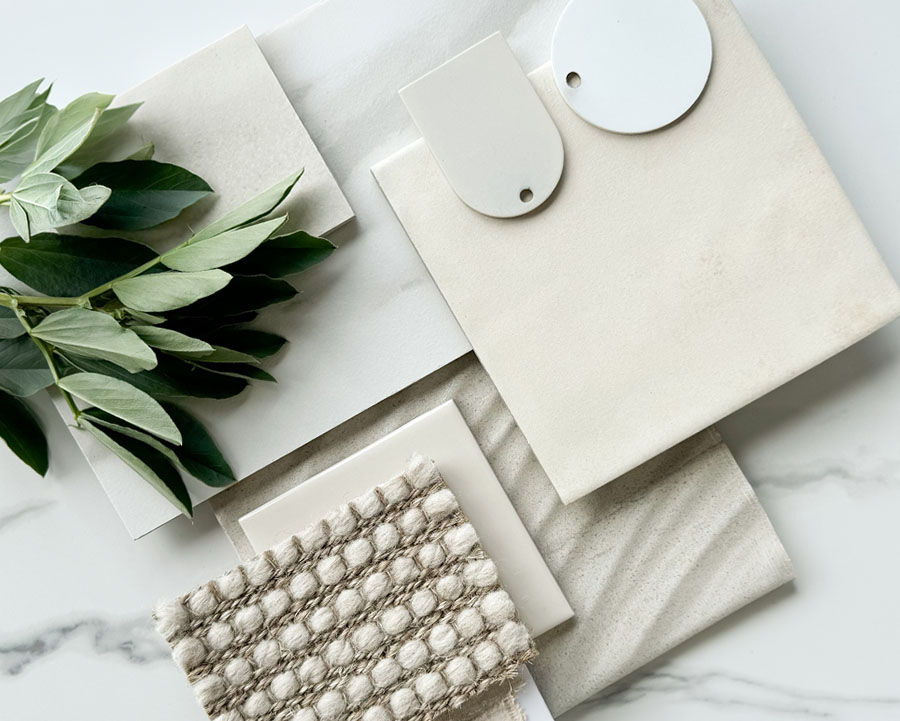
White is one of the most versatile colours in interior design, often associated with cleanliness, simplicity and a sense of openness. It can make spaces feel brighter, larger and more airy by reflecting natural light, which is why it remains a popular choice for bathrooms, kitchens and minimalist interiors.
The tone of white can significantly change the mood of a space. Warm whites with subtle beige or cream undertones create a softer, more welcoming atmosphere, while cooler whites with blue or grey undertones provide a cleaner, more contemporary feel. These undertones become particularly noticeable when paired with tiles, cabinetry and natural light, making it important to view samples in your own space before committing to a colour palette.
Colour Associations: Cleanliness, simplicity, openness, freshness and clarity.
Design Tip: View white tile samples in your own space at different times of day — undertones shift noticeably under artificial versus natural light.
Brown Colour Interior Design: Stability and Warmth
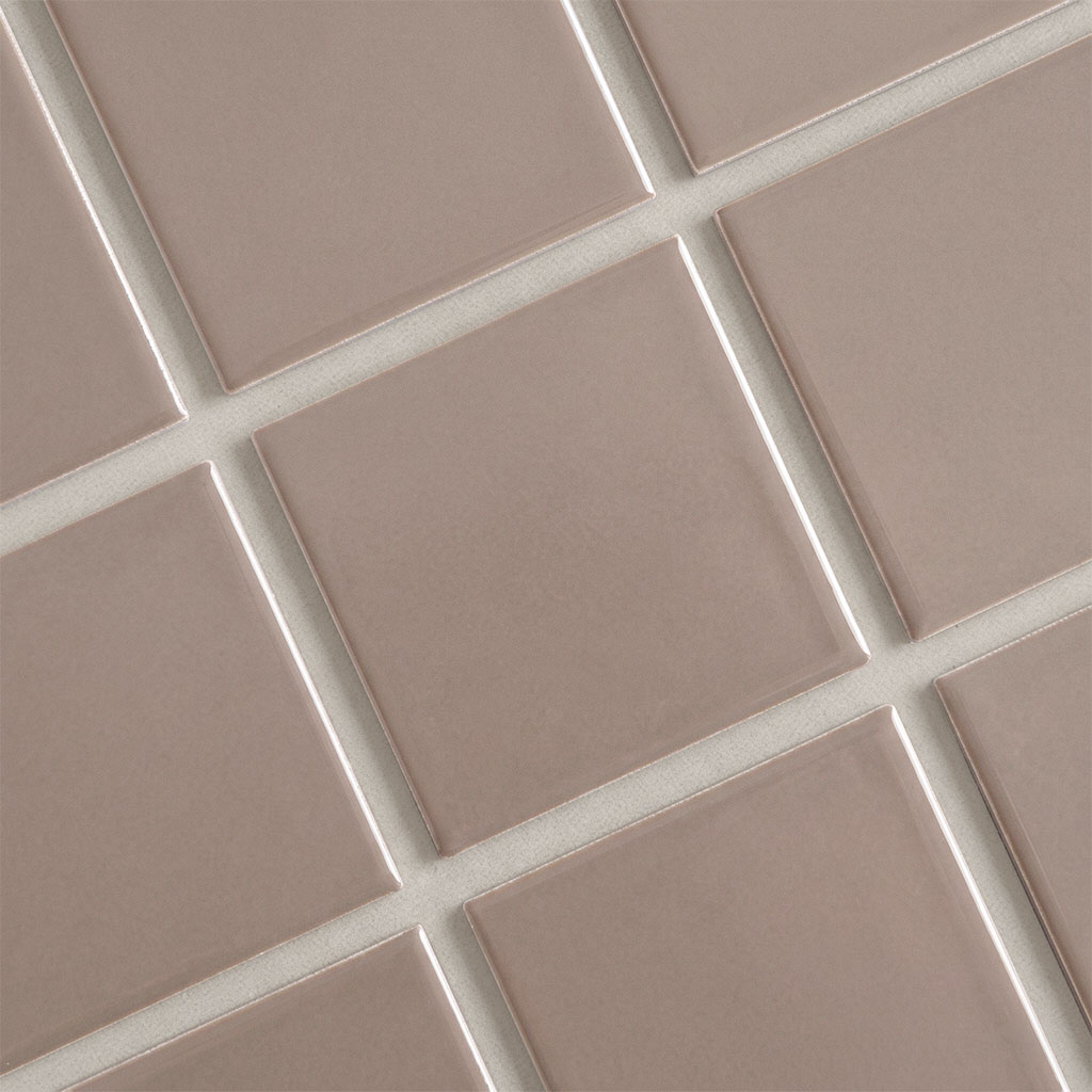
Brown colour psychology is strongly associated with stability, warmth and a connection to the natural world, making it a popular choice for homeowners seeking a warm and inviting atmosphere. From soft beige and sandy tones to richer chocolate and walnut shades, brown provides a versatile foundation that works beautifully with natural textures, earthy greens and layered neutral palettes.
Brown tones are a defining feature of Modern Organic, Japandi and Scandinavian-inspired interiors, where they are often paired with timber, stone-look tiles and tactile materials to create spaces that feel connected to nature.
Colour Associations: Stability, warmth, comfort, reliability and connection to nature.
Design Tip: Use warmer brown tones alongside lighter neutrals, natural stone-look tiles and timber features to create depth without making a room feel dark.
Grey Colour Interior Design: Balance and Sophistication
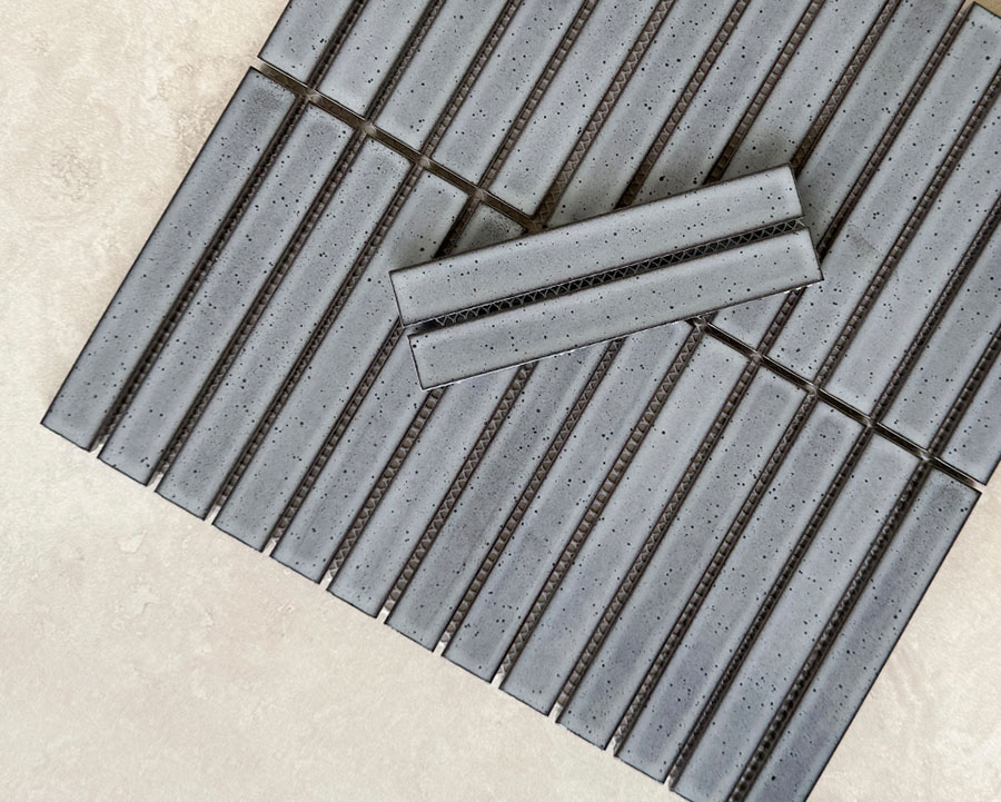
Grey is one of the most versatile colours in interior design, offering a balance between understated simplicity and modern sophistication. Grey colour psychology in interior design is often associated with calm, stability and refinement, making it a popular choice for contemporary homes.
The mood created by grey depends greatly on its undertones. Warm greys with beige or taupe influences create a softer, more welcoming feel, while cooler greys with blue undertones can create a cleaner, more architectural look. Deeper charcoal tones add contrast and drama, making them ideal for feature areas or bold contemporary designs.
Grey tiles work beautifully across bathrooms, kitchens and living areas, providing a timeless foundation that complements a wide range of colours, textures and materials.
Colour Associations: Balance, sophistication, calm, neutrality, stability and modernity.
Design Tip: If you’re using grey tiles throughout a room, introduce warmth through timber, brass, soft furnishings or natural textures to create a more layered and welcoming space.
Black Colour Interior Design: Sophistication and Grounding
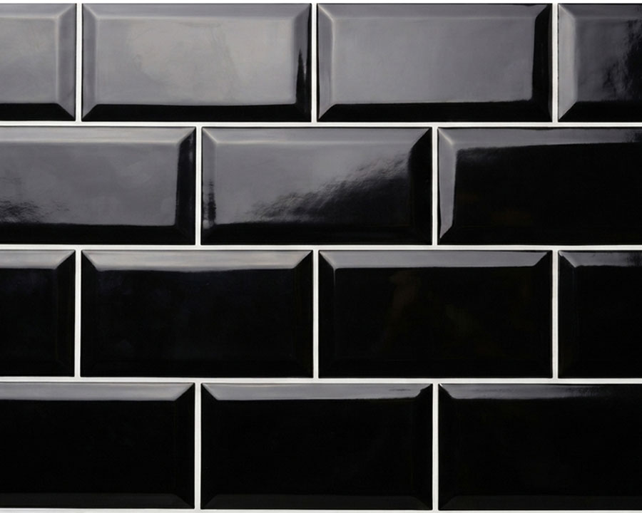
Black is often associated with sophistication, confidence and a sense of grounding. While darker tones can create a dramatic atmosphere, they can also add depth, definition and a feeling of luxury when used thoughtfully. Rather than making a space feel smaller or heavier, black can create a considered and architectural feel when balanced with the right lighting, textures and complementary tones.
Black is commonly used in contemporary and modern interiors, where clean lines, simple forms and contrasting materials create a refined aesthetic. It works particularly well as a feature wall, statement floor or accent colour, allowing other elements such as timber, stone, greenery and metallic finishes to introduce warmth and balance.
Colour Associations: Sophistication, confidence, strength, elegance and grounding.
Design Tip: Use black and white tiles in a checkerboard pattern to create a timeless classic look. For a more dramatic interior, consider using charcoal tiles from floor to ceiling to create a rich, moody bathroom design.
Choosing Tile Colours for Your Home
Knowing the psychology is one thing — applying it with confidence is another. A few practical principles make it easier:
- Use the 60-30-10 rule. 60% dominant colour (walls, floors), 30% secondary colour (furniture, larger fixtures), 10% accent (cushions, art, smaller tiled features). This keeps a room balanced rather than cluttered or overbearing.
- Colour isn’t only about hue. Saturation (how vibrant a colour is) dramatically changes its emotional impact. Soft, muted colours generally feel calmer and more sophisticated, while highly saturated colours tend to feel more energetic and stimulating.
- Consider undertones. Two tiles may appear similar until they’re installed side by side. One may have warm undertones while another leans blue or cool undertones. Undertones become especially noticeable when paired with cabinetry, paint and natural stone.
- Always test in the real room. Natural light changes dramatically through the day, and light in your home can appear differently than in the showroom. We recommend getting physical tile samples and viewing them morning, midday and evening before committing to make sure you are happy with the colour you’ve selected.
- Consider finish alongside colour. A gloss or polished finish will bounce more light and intensify a colour; a matt finish softens it. The same colour in two different finishes can feel like two different palettes entirely.
- Let flooring and tiles do some of the heavy lifting. Because floor and wall tiles cover such a large surface area, they often set the emotional tone of a room more than any single piece of furniture — which is worth keeping in mind when choosing tile colours for a renovation.
- Don’t try to include every colour you love in one room. Creating a consistent theme throughout the home helps with cohesion and stops the home from feeling disjointed. Restricting yourself to two or three dominant hues usually creates a calmer, more cohesive interior.
Frequently Asked Questions
What is colour psychology in interior design?
Colour psychology is the study of how different colours influence emotions, mood and behaviour within a space. In interior design, it’s used to help choose colours that support how you want a room to feel — calming, energising, grounding or comforting — rather than colour choices based on appearance alone.
Which colours are the most calming for a home?
Cool colours such as blue and green are most consistently linked with calm and relaxation, which is why they’re common in bedrooms and bathrooms. Soft, muted neutrals (beige, warm grey, taupe) also read as calming, since lower saturation generally softens a colour’s emotional intensity regardless of hue.
Which colours make a room feel more energetic?
Warm colours — red, orange and yellow — are most associated with energy and stimulation. Because of their intensity, they’re usually more effective as accents (a splashback, a feature wall) rather than covering an entire room, where the same energising effect can start to feel overwhelming.
Does the psychology of a colour change with its shade or saturation?
Yes — the emotional association of a colour isn’t fixed to its hue alone. A soft, muted version of a colour (pale sage, dusty pink) tends to feel calmer and more sophisticated, while a highly saturated version of the same colour feels more energetic and stimulating. Natural light and finish (matt vs gloss) also change how intensely a colour reads in a room.
Is colour psychology in interior design backed by science?
It’s a widely applied practice rather than an exact science. Many colour-mood associations are well recognised and consistently used across architecture, retail and hospitality design, but personal preference, culture and individual experience all shape how someone actually responds to a colour.
Create a Home That Feels Right
Colour has the power to influence how we experience our homes. By understanding colour psychology in interior design and carefully choosing tile colours, you can create interiors that not only look beautiful but feel right for the way you live. Browse our extensive range of tile colours and order tile samples to experience the colours, textures and finishes in your own space before making your selection.
